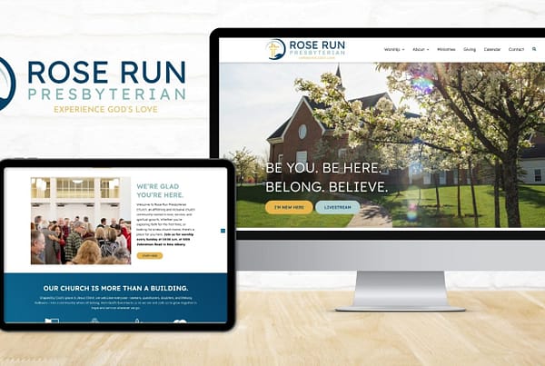
While browsing the internet looking at different web designs I always come across websites that make something really interesting designs from simple concepts. Some of the coolest sites I’ve seen are ones that use different techniques for scrolling. These are some website design that not only used the idea of scrolling, but made scrolling a part of the experience of being on that website. Check them all out here.
“There was a time when the common practice was to try and place all content above the fold. But now, instead of fearing the scroll, web designers and developers are embracing the need to scroll, and using it as opportunity to engage the user with background reveals, element animations, and other clever effects based on the pages scroll position. So in an effort to inspire you, we’ve gathered a collection of websites that take scrolling to the next level.”
-Gisele Muller


