A new logo design for Asterisk Global Services
A strong brand presence is vital for success. That’s why Asterisk Global Services partnered with our team to create a sleek and professional logo that reflected their brand. Through an iterative process, Robintek transformed their vision into a logo that truly represents Asterisk Global Services. In this article we’ll show you the Asterisk Global Services logo design and explain the process behind how Robintek creates logo designs.
Understanding the Vision
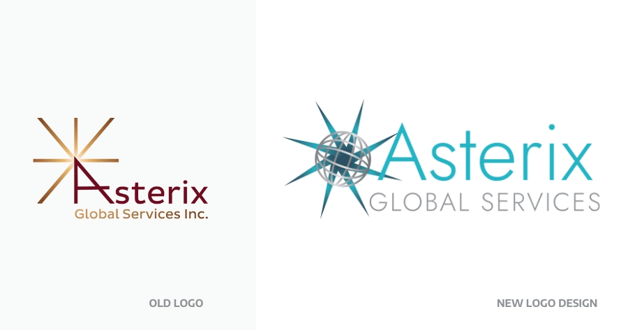
At Robintek, we begin every design project with a meeting to understand the client’s vision, needs, and preferences. For Asterisk Global Services, the goal was a professional logo that would better represent their company. They wanted to incoporate a starburst or asterisk-like symbol and global elements. They were also inspired by metallic finishes and wanted their logo to have depth and shine. This understanding laid the foundation for an exceptional logo design.
Our Logo Design Process
Our logo design process thrives on collaboration and open communication with our clients. To explore diverse design possibilities, we immerse ourselves in existing branding while drawing inspiration from various sources. By aligning with the company’s values and identity, the resulting logo and branding materials seamlessly represent Asterisk Global Services. Our initial phase involves presenting 6-8 black and white logo options, allowing clients to focus solely on design elements without the influence of color. This approach ensures a strong and versatile foundation that can adapt to different applications.
The Road to an Impressive Logo
Hand in hand with Asterisk Global Services, we refine and innovate throughout the design journey. Multiple rounds of revisions transform initial designs into a captivating emblem resonating with our client’s aspirations.
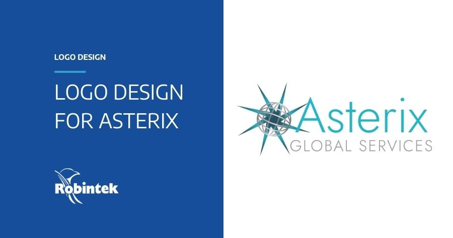
The final logo design emerges as a striking representation of Asterisk Global Services’ identity. It showcases a vibrant blue metallic starburst, alongside a sleek silver metallic globe symbolizing their global reach. Complementing the mark is a clean and modern sans serif font, usable alongside the logo or independently. The starburst globe brand mark can also stand alone as a powerful asset. Seamlessly integrating the starburst with the text creates a sense of connection and unity, reinforcing the company’s values.

The Outcome
Asterisk Global Services was thrilled with the final logo design, commending our ability to bring their vision to life. The logo captures their corporate identity with its sleek aesthetics and global appeal. It serves as a powerful representation of Asterisk Global Services’ expertise in company formation, compliance, accounting, and consulting services within the F&I industry. Equipped with their new logo and branding guide, Asterisk Global Services is poised to make a remarkable impact on the global stage.
The logo design journey undertaken by Robintek for Asterisk Global Services exemplifies the power of collaboration and attention to detail. From understanding the client’s vision to crafting a captivating emblem, Robintek’s commitment to excellence shines through. The final logo, adorned with a blue metallic starburst, a silver metallic globe, and clean typography, embodies the essence of Asterisk Global Services. With their new logo and branding guide, Asterisk Global Services is poised to make a lasting impression, showcasing their expertise in the F&I industry’s company formation, compliance, accounting, and consulting services on a global scale.
At Robintek, we are committed to helping businesses and organizations achieve their goals through creative and effective design solutions. If you need help with a logo redesign or any other design project, please don’t hesitate to contact us to discuss how we can help you.
