Woody's Wings multimedia design examples

Woody’s Wing House

We worked with Woody’s Wing House leadership to develop their brand identity, and then apply those design elements throughout their marketing materials and website. Putting together a strong foundation for their brand we began this process with logo development followed by a branding guide that would serve as a roadmap for all future marketing and brand materials. We applied this guide to complete their suite of marketing materials including their website, print materials, and signage.
Metro Parks

Metro Parks is dedicated to conserving open spaces while providing places and opportunities that encourage people to discover and experience nature. As central Ohio locals, our team has enjoyed various Metro Parks locations and programs over the years and we were thrilled to have the opportunity to partner with them to further their mission.

Metro Parks website on desktop, tablet, and mobile screens
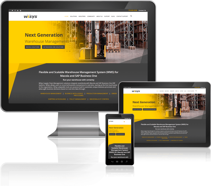
WiSys Responsive Website Design on multiple Devices

WiSys

When the WiSys team contacted Robintek, they had an existing website, however it was in need of a major update. The site was not responsive, and the design didn’t reflect their brand well. They needed their website to be mobile responsive with a focus on improving user experience and increasing organic leads. They wanted recommendations to improve their navigation and Search Engine Optimization (SEO) and they needed a team that could implement those recommendations. They wanted to improve the overall look and feel of the site as well as it’s functionality so they could better engage with and serve their customers.

Mueller Electric

The Mueller Electric team contacted Robintek because they were looking to update their WordPress site of 1200+ parts into a catalog ecommerce site. They also needed some custom features including a stock check tied into distributor inventory and advanced product search and sort options. They wanted to create a custom website that was focused on user experience, with every element organized and designed to streamline user’s ability to find the products they need.

Mueller Electric Website
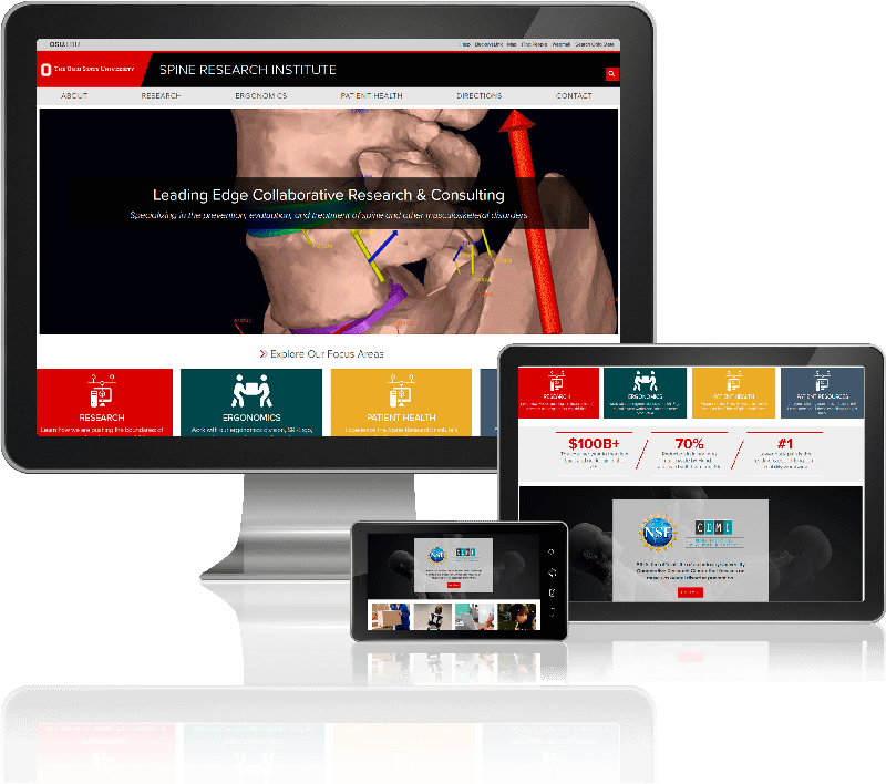
OSU SRI website on desktop, tablet, and mobile screens

OSU SRI

OSU SRI’s three different user groups are patients researching back pain, researchers ranging from peers at other universities to graduate students considering SRI and industry partners interested in improving the occurrence rate of back injuries within their workforce. An underlying objective was to effectively communicate to each of these groups, as well as the public at large, the significant impact of low back and neck pain on our society.

The Pint Room & The Half Pint

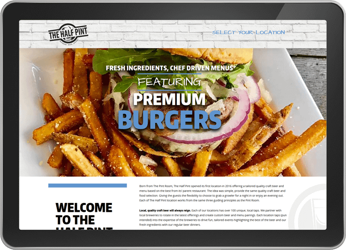
We worked with The Pint Room and The Half Pint Leadership to create two sister websites that had custom designs that were similar, but unique to each brand. The Pint Room and the Half Pint each had their own website and main landing page and both contained subsites for each restaurant location. We included email sign ups to gather user’s information for mailing lists and to allow for more customer interaction. We’ve also featured social media links and a feed for continued customer engagement.

The Pint Room website on tablet
ADAMH Responsive Website on Device Screens

ADAMH

The ADAMH team contacted Robintek when they were exploring options for redesigning and overhauling their website to better serve their community and communicate their mission. The existing ADAMH website was large, and difficult to navigate. While it included important information for the various groups they serve and partner with, much of that content was not organized or written in an accessible way for their intended audience. The ADAMH team needed a web design agency that could meet these challenges and deliver results.

busSTRUT

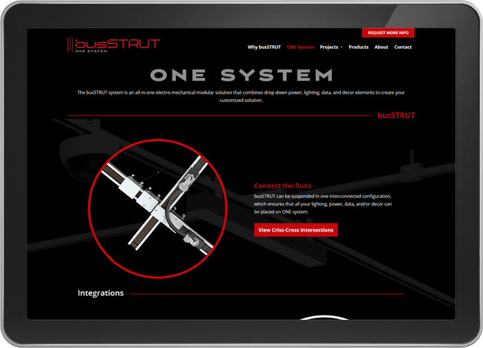
Robintek created a modern, streamlined design that clearly explains the busSTRUT product. We included interactive graphics of the busSTRUT system, where users can add or remove various elements of the busSTRUT grid. This feature allows visitors to see how comprehensive and innovative the busSTRUT system is. We also included a section calling out what makes busSTRUT different from traditional systems. busSTRUT has solved many of the challenges of architectural and electro-mechanical systems, and we wanted to highlight those innovations.

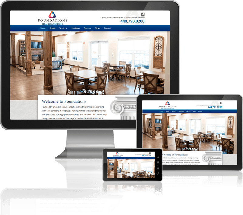
Foundations Website on Screens
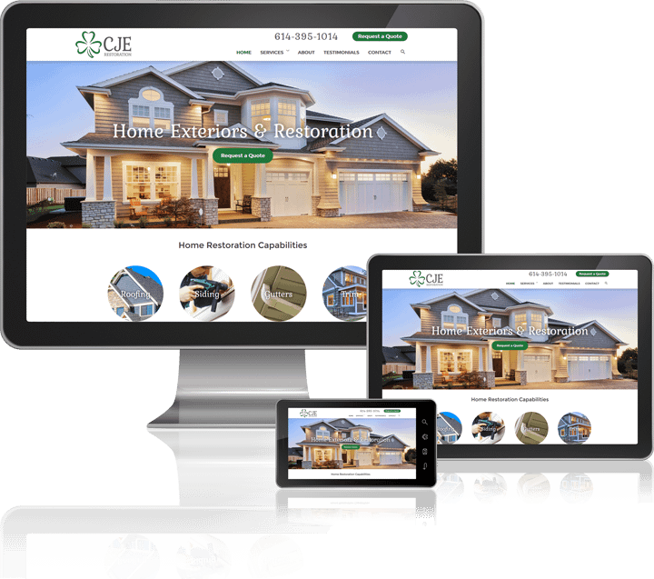
CJE Restoration Mobile Website Design

CJE Restoration

We worked with CJE Restoration to establish their brand assets, website and marketing materials. They had an idea of the direction they wanted to go with their branding and we were able to help bring those ideas to life. We were then able to build their brand and marketing assets around this foundation. We made sure to listen to the CJE Restoration team throughout the process, keeping their business goals at the forefront of everything we did. We were able to work together to create a dynamic, beautiful website that is optimized for user experience and SEO, and communicates their brand’s message clearly to potential customers.

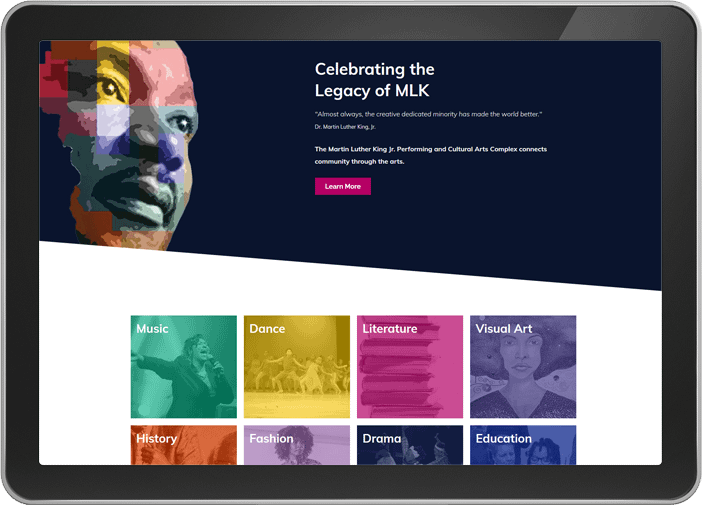
King Arts Complex

Robintek was honored to work with The King Arts Complex to redesign their website and partner with them to find online solutions that help them advance their mission and connect with the community. We designed The King Arts Complex website to be an extension of the vibrant spirit and further the mission of the organization. Through a strong visual representation of the brand and dedication to promoting and clearly conveying information to site visitors, the website will serve as a tool to help connect community through the arts.

King Arts Complex website on tablet
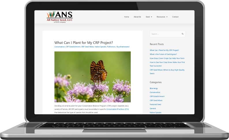
ANS Website Content Creation on Laptop

FDCE & ANS

FDCE and its sister company, ANS, are big players in the conservation industry. But despite their strong reputation, they were having a difficult time getting found online by their target audience. To boost their visibility in the market and establish authority in their field, Robintek began producing SEO-driven content for their website’s blogs.

The Arts College & Preparatory Academy

We created a dynamic redesign for the ACPA website that showcases their brand and culture through bold visuals and updated content. Their existing branding, with its bold colors and textures was underutilized in their old site. We brought those vibrant colors to the forefront, using color to enhance visual hierarchy, and to highlight various content throughout the site.

ACPA home page on tablet screen
Foundations Website on Mobile and Tablet Screens

Foundations Health Solutions

Foundations Health is Ohio’s premier long-term care company managing over 50 nursing homes specializing in physical therapy, skilled nursing, quality outcomes, and resident satisfaction. With strong Christian values and heritage, Foundations Health Solutions is committed to serving our communities with the highest level of clinical excellence and resident satisfaction, along with a strong employee culture which places priority and resources on the direct caregiving team.

Contact Us